Compositional Sketches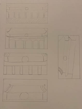 In ProgressFinal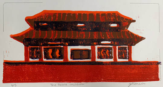 Questions
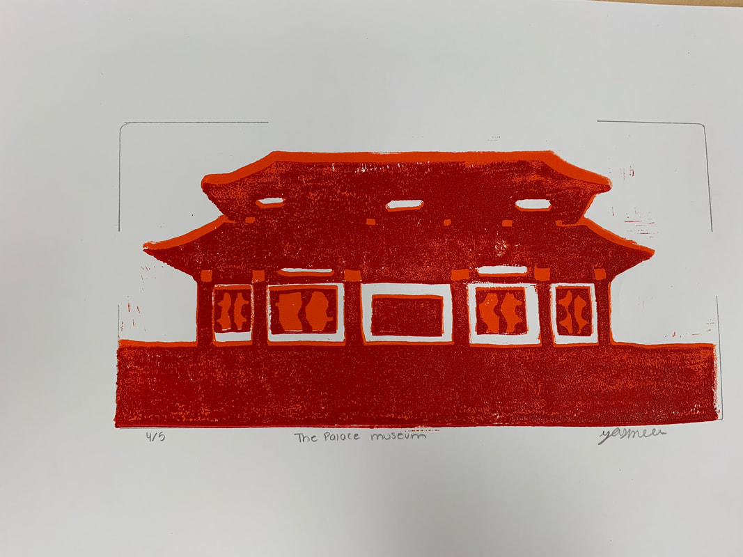
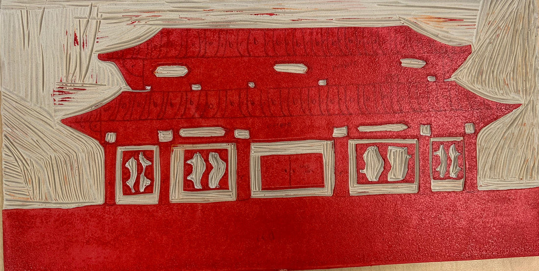
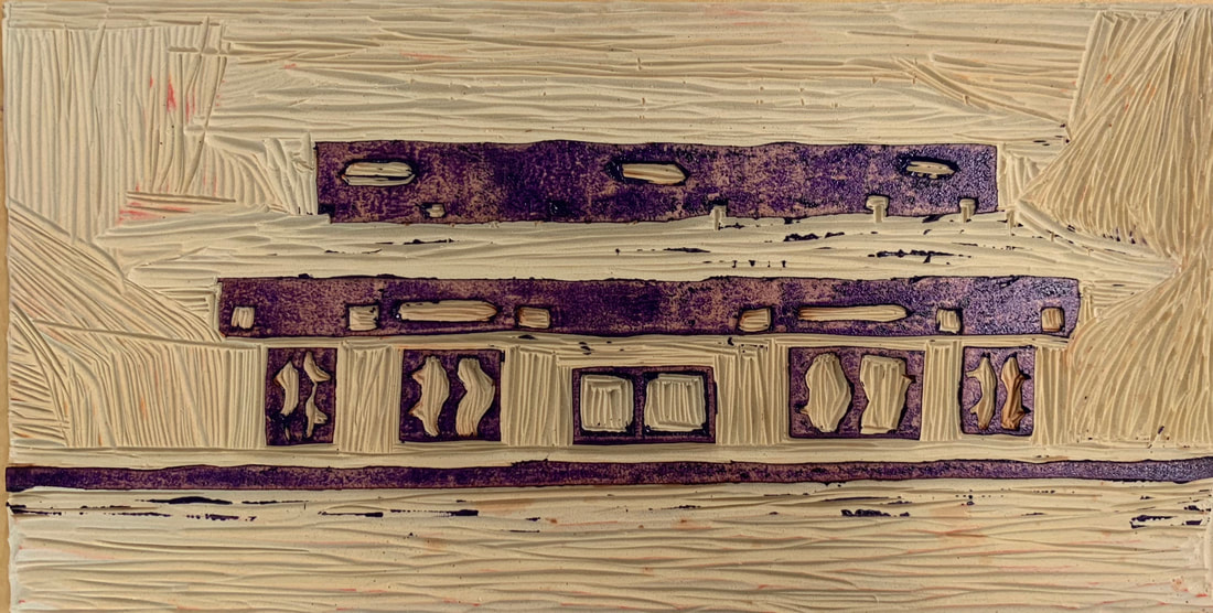
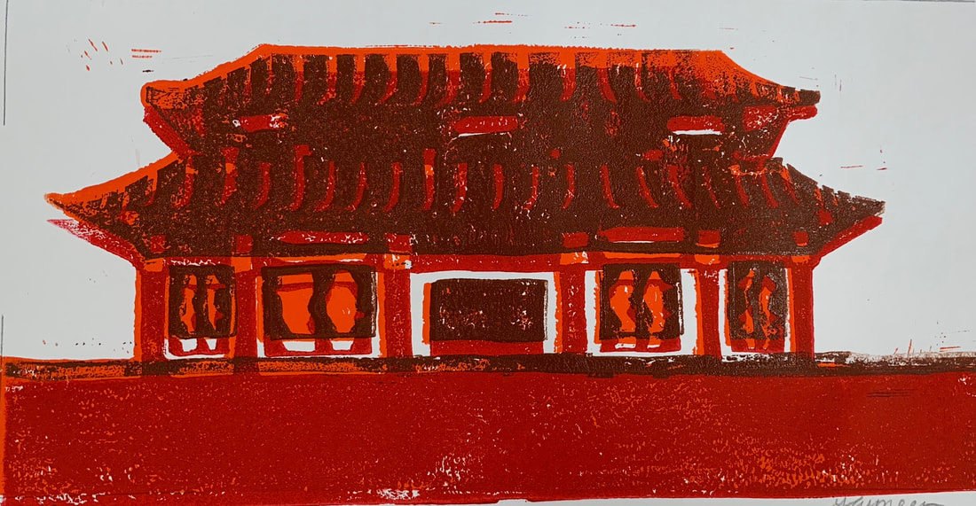
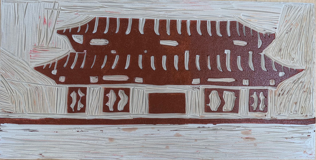
I think the craftsmanship was pretty good for the design and the transferring of the design to the linoleum. I had some small circles and squares which were a little hard to carve and keep them as small as I wanted. Overall, I think the carving and registration turned out well. -burnishing and ink coverage I think the ink coverage turned out well after the practices and figuring out how much ink I needed to use. The hardest part was lining up the prints and making sure they all looked right. It was also hard to not get the ink on the smaller pieces around the carvings. 2.How did you use texture, color harmony and balance to define your choice of subject?-texture I added texture by having the roof be two different colors to add dimension. I also added the small circles and squares to add more texture. -color harmony I tried to use colors that went well together and that were in the same color family. I also put it on white paper to make the colors stand out. --balance The design is symmetrical so both sides are pretty much the same. It was balanced because both sides are the same. 3.If you could recreate your pieces what would you do differently to enhance your final outcome?I would use different colors that went together better. I would also carve the outside of the design better so there aren’t as many lines on the outside.
0 Comments
Leave a Reply. |
AuthorWrite something about yourself. No need to be fancy, just an overview. Archives
May 2019
Categories |
 RSS Feed
