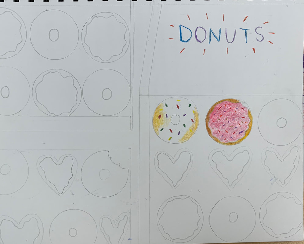
In Progress PicturesFinal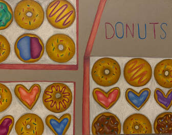 Critique Questions1.Describe the overall composition of your artwork (balance, unity, rhythm and movement).
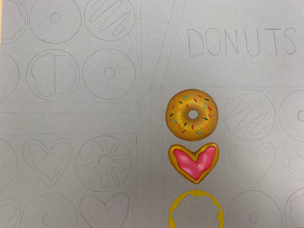
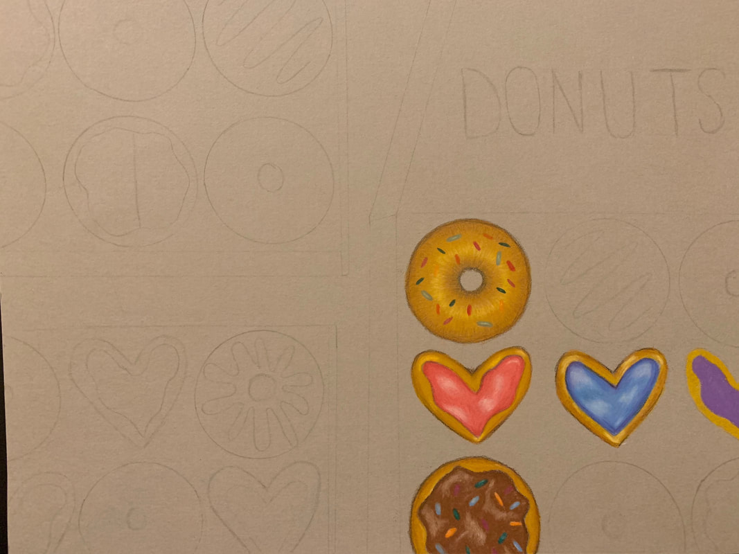
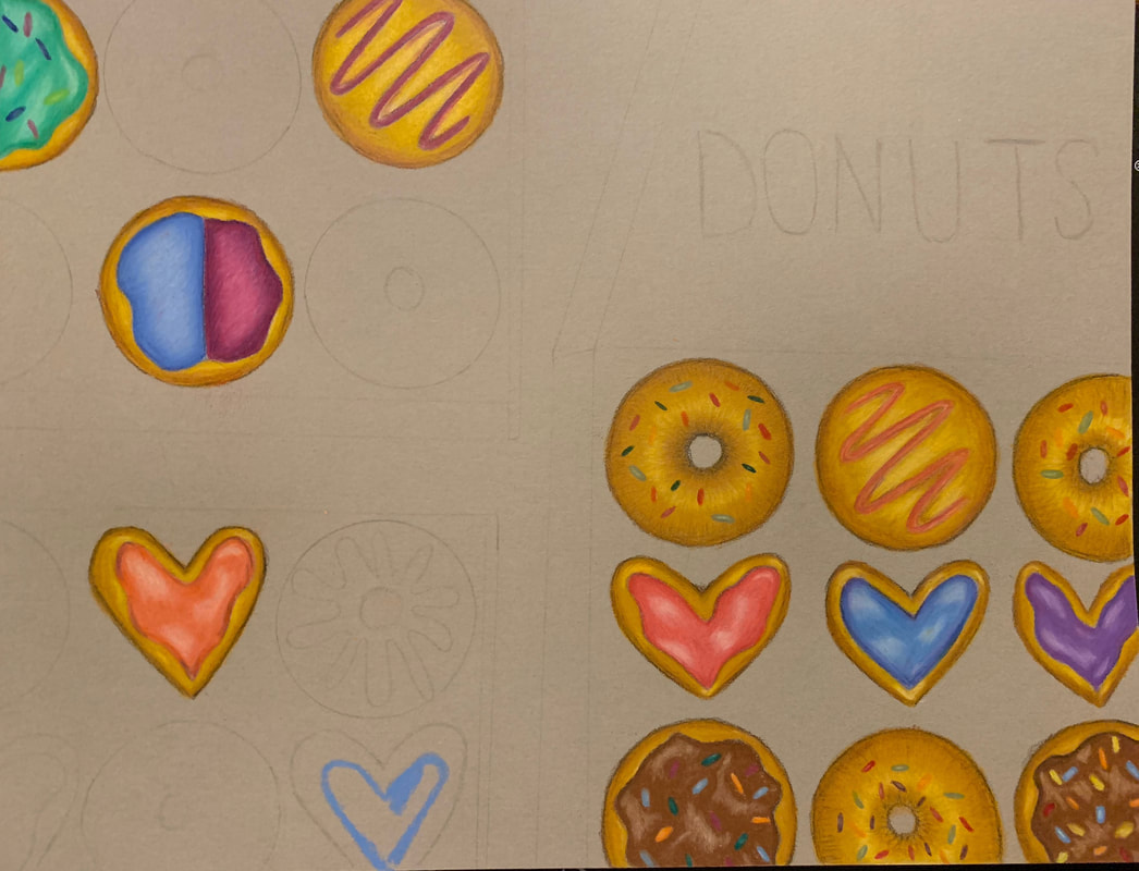
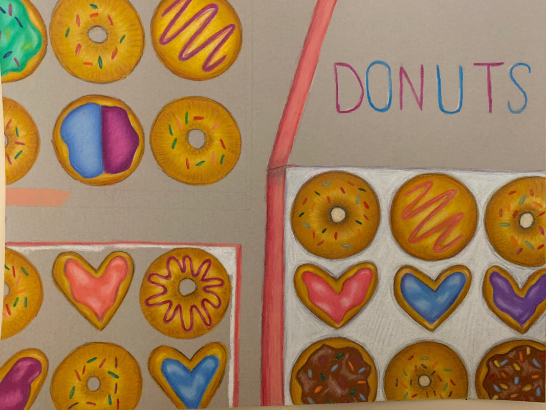
My composition of the donut boxes had a balance of negative space and areas that were filled. I feel like by having some negative space it made it more balanced and appealing to the eye. 2. How did you use value to create dimension? Is this important? Why? I added value to the donuts by making the top look brighter and the lower you got it got darker. This gave the illusion that they were round. It is important because it makes it look more realistic and not as flat. 3.What did you achieve by using exaggerated color? Using exaggerated color allowed for the donuts to look more vibrant and realistic. Also by adding different colors you wouldn’t expect in the darker areas it helped add dimension. 4.Describe the craftsmanship of your colored pencil/chalk pastel. (How good the project is technically crafted)I think the craftsmanship of my colored pencil piece was very well as it showed dimension within each donut as well as with the boxes. I used lots of colors, which made it vibrant and what I was going for. 5.Were you able to achieve depth by showing a foreground, middle ground and back- ground? Explain.I was trying to get a birds eye view of the donut boxes so they were all the same distance away from the view. If I were to do it again I might make the boxes/donuts at different distances from the viewer. 6. Explain your experience with colored pencil/chalk pastel. What were the obstacles and advantages?Colored pencil is my favorite medium so far as you can really build up the color and they blend easily. It also allows for the most realistic looking. An obstacle was that it takes time to really build up the color
0 Comments
Leave a Reply. |
AuthorWrite something about yourself. No need to be fancy, just an overview. Archives
May 2019
Categories |


 RSS Feed
