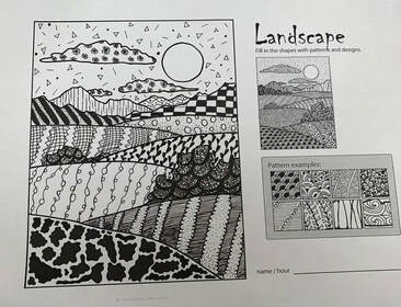
 For this warm up we had to use patterns from our 100 patterns and put them into the landscape. We had to show value by using different patterns (light and dark). We also had to wrap the patterns to make them look curved. 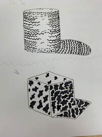 We had to choose two patterns to put on a cylinder and a cube and give a light source and show value. They also had to go with the shape so it doesn't flatten it.
0 Comments
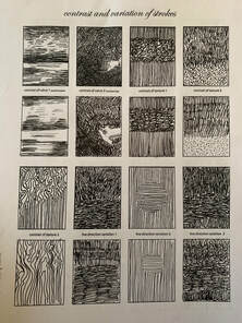
 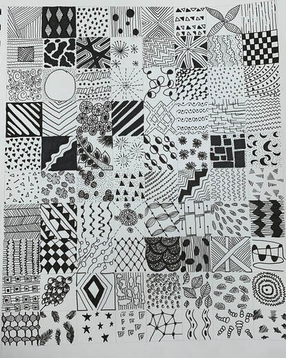 We had to make 100 designs using pen and ink that demonstrate all the values of a value chart. The darker values were mostly covered in the ink with little paper showing and the opposite for the lighter values.
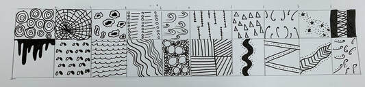
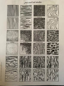
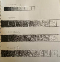
For this warm up we copied the textures in pen + ink using different techniques such as stippling, hatching. I also used different amounts of pressure to create thicker and thinner lines.
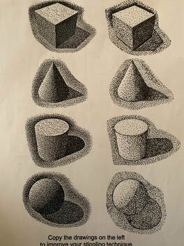
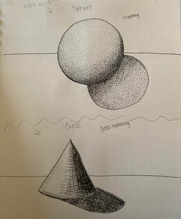
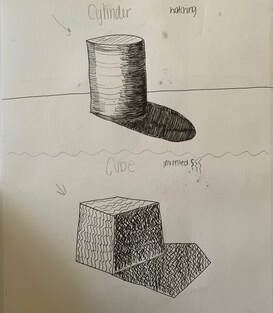
For this warm up we drew the four different shapes (sphere, cone, cylinder and cube). I did stippling for the sphere, cross hatching for the cone, hatching for the cylinder, and invented for the cube. 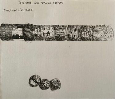 This was the warm up where we copied the textures on a cylinder and 3 spheres from the youtube video. There was also value in each texture.
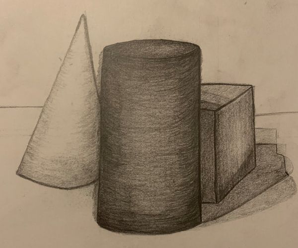
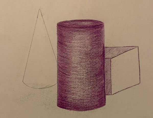
We had a still life of three shapes to draw, one with regular pencils and the other with colored pencils. They were all different colors so we had to learn to add value and show the different colors. I never got the chance to finish the one with colored pencils.
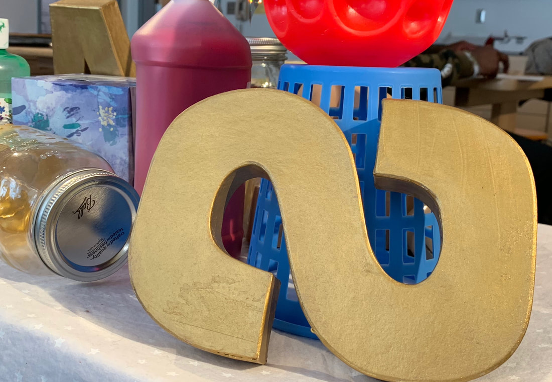
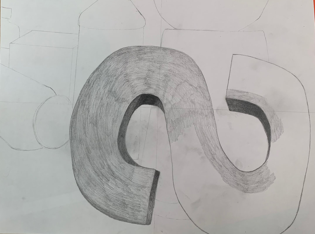
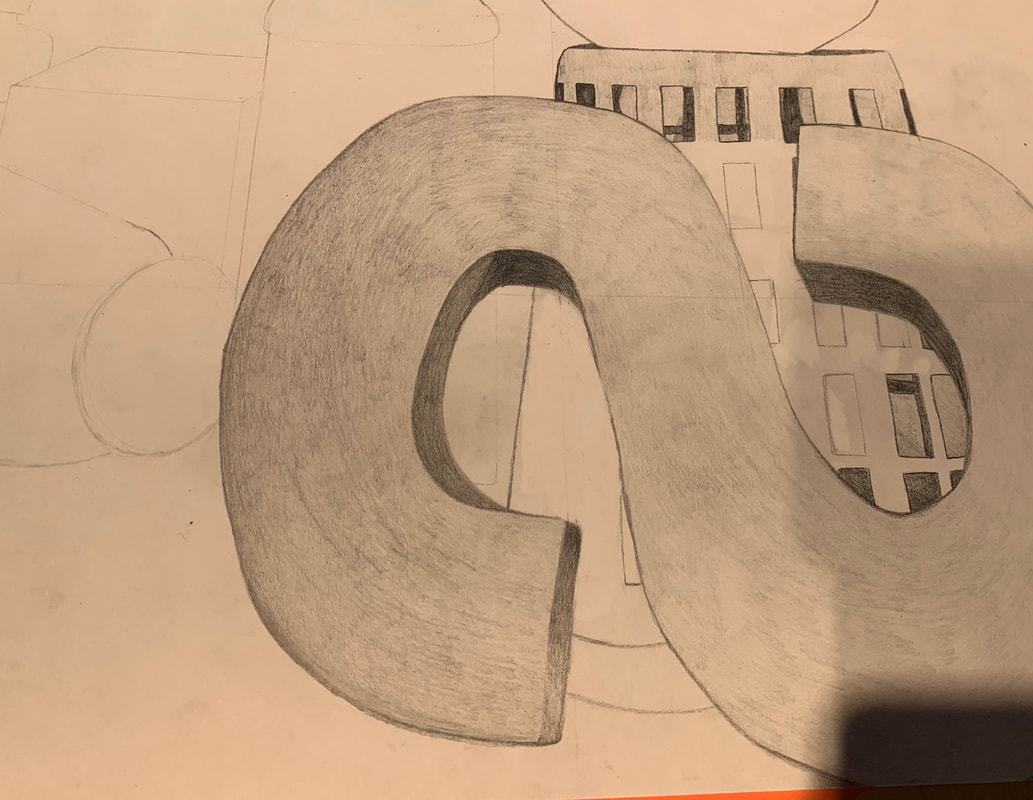
1. Describe how you arranged your composition. Discuss your use of the elements and principles. Is it a successful composition? I arranged my composition with the “S” taking up a big portion of the composition and the other items in the background. I used variations in space and value to make it look realistic. I think if I were to redo the composition I wouldn’t have the “S” be as big as it is. 2. Did you use a wide range of values? (A range from white to black with at least 9 values). Explain how is this evident? Yes I used a wide range of values, it was very dark in the spaces where the objects overlapped to create contrast and show they were at different levels. I made the highlights white and used the malleable eraser to help with that, especially on the mason jar. 3. Explain how your knowledge and creating practice studies with value contributed to your piece. By having the practice pieces we did with the different shapes and adding value to those, I was able to learn to shade and add value to different shapes and make them look 3-D and not flat. Also, previous knowledge of value in Art 1 helped to show to highlights and shadows and overall make the piece look more realistic. 4. Describe the blending and transitions in your objects (discuss your use of pressure with pencil and other techniques to achieve this). To blend I would take a lighter pencil and go in tall circles instead of up and down to help fill in any gaps. I also added more pressure when getting closer to the edge of an object to add more contrast. In the lighter parts I used a very light hand. 5. Explain how your interpretation of texture is essential in capturing the look of the object. Most of the objects were smooth such a the paint bottle, ball and basket, so it was important to make it look smooth in the picture by getting trying to get rid of as many pencil lines as possible without a blender. The “S” has a little bit of texture so having some pencil lines helped add to that. 6. If you could recreate your pieces what would you do differently to enhance the final outcome? I would work on my transitions to the edge and make it look more like a transition and less like an outline. I would also work on making the Mason jar look more see through. Composition Sketches+ original photoIn Progress PicturesFinal Piece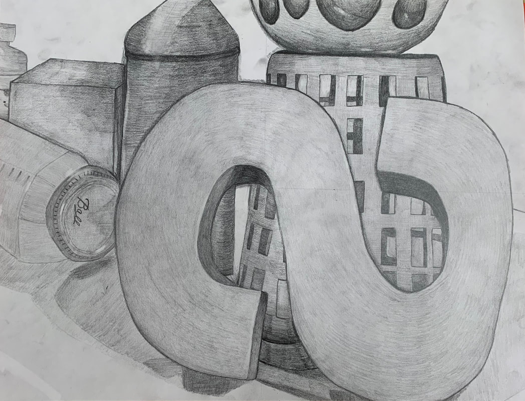 |
AuthorWrite something about yourself. No need to be fancy, just an overview. Archives
May 2019
Categories |


 RSS Feed
