|
I signed up for this class as an easy A and I quickly realized I would have to actually put in work to do well. It was more work but I ended up learning a lot. I learned the importance of composition and how that can change the outcome of your piece. I also learned the importance of having multiple compositional sketches. Many times the composition I thought I was going to do ended up being my least favorite after doing the sketches. I liked having warm up projects because they gave an introduction into the medium. My favorite medium was colored pencil because you could build it and blend them together. My least favorite was pen because it was hard to add dimension and took a long time and was very tedious. Overall, this class was a good continuation to art and I definitely learned a lot and my art improved.
0 Comments
Value Chart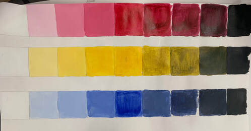 For this we made a value chart with tints and shades with 3 different colors Color Wheel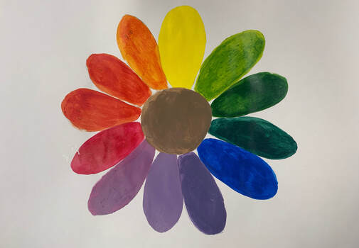 For this we had to make a creative color wheel with all the colors (primary, secondary and tertiary) and I decided to do a flower.
Overview of both artistsGustav Klimt: Gustav Klimt was the leader of the Vienna Secession movement, which marked the beginning of modern art in Austria. He uses symbolism of the the human psyche and sexuality through his lavish pattern and figures. His combination of sexuality, atmosphere, and expression was highly controversial of the time. Amedeo Modigliani Amedeo Modigliani was an Italian artist who modernised figurative painting. His paintings are identified by their elongated bodies, blank eyes and use of lines. Each painting told a story about his life and art. Citations: Gustav Klimt Born in 1862, Gustav Klimt was the leader of the Vienna Secession movement, which marked the beginning of modern art in Austria.The Vienna Secession movement was when progressive artists broke away from the old-fashioned style of art.This movement is significant because it gave contemporary art dedicated time and attention in the city. He uses symbolism of the the human psyche and sexuality through his lavish pattern and figures. His combination of sexuality, atmosphere, and expression was highly controversial of the time. His work is characterized by its use of gold embellishment, abstract patterns and lots of color. He uses a mix of natural and abstract styles. The majority of his paintings are flat and lack dimension and depth which gives the viewer a unique look at his painting. In many of his pieces, he ignores the rules of composition and will give a different perspective by having one aspect take over the whole canvas. When painting, Klimt uses his brush in many different directions and with varying amounts of pressure to get the desired texture and look. He used thick, bright paint that rose off the canvas at times. 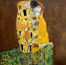 “The Kiss” is the most popular of Gustav’s paintings and what he is known for best. This painting was the final painting of his Golden Period. His Golden Period was when he painted multiple paintings with the similar gilded style. It was painted in 1908 using oil and gold and silver leaf on a square canvas. This painting features a couple intertwined in a field of wildflowers. He uses rectangular, black, white and grey patterns for the male’s robe and a colorful circular pattern for the woman’s robe. The patterning of gold around the bodies creates almost a halo around the couple. He builds up the circular gold canvas and they rise off the canvas while the darker gold background is flat on the canvas. He used a combination of abstract (robes) and realistic (flowers) patterns with gold embellishment all throughout. Klimt’s use of flatness and lack of depth and perspective emphasizes his gilded work. 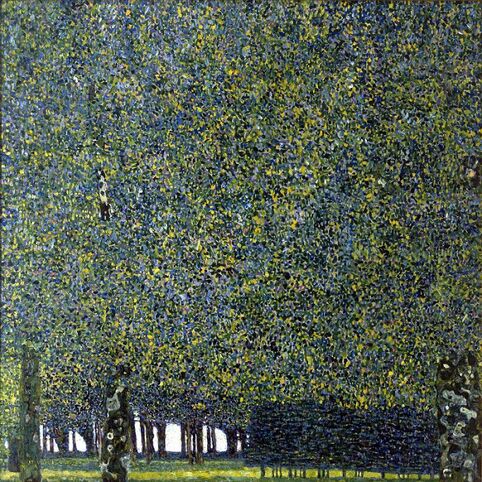 “The Park” is an example of one of Klimt’s peaceful impressionist landscapes. He painted this with oil on canvas in 1910. It uses the natural scenery and colors of the trees with hints of other colors such as blue and red. Gustav Klimt ignores the rules of composition in this work as he has the top half of the trees taking over the majority of his composition. The actual park is only on the very bottom of the painting which gives a unique point of view that allows the viewer to feel as if they are in this dense forest. Like the majority of his paintings the top is flat and doesn’t give dimension however, he shows that depth in the bottom of his work which lengthens the piece. He mainly uses different shades of green, yellow and blue through a dot and sponge pattern to create the texture of the leaves. He would use the different shades of the colors to highlight and add shadows to the trees. When painting the park, Klimt used swift brush stroked upwards to achieve the dot effect also adding a spongy feel. Citations
Sketch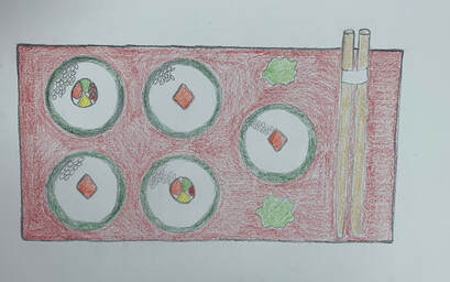 In Progress PicturesFinal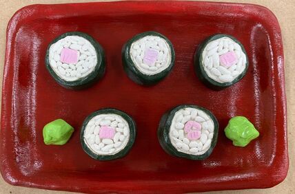
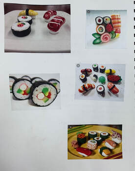
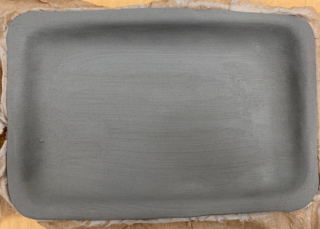
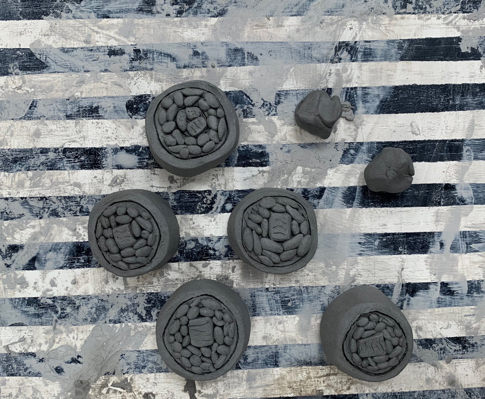
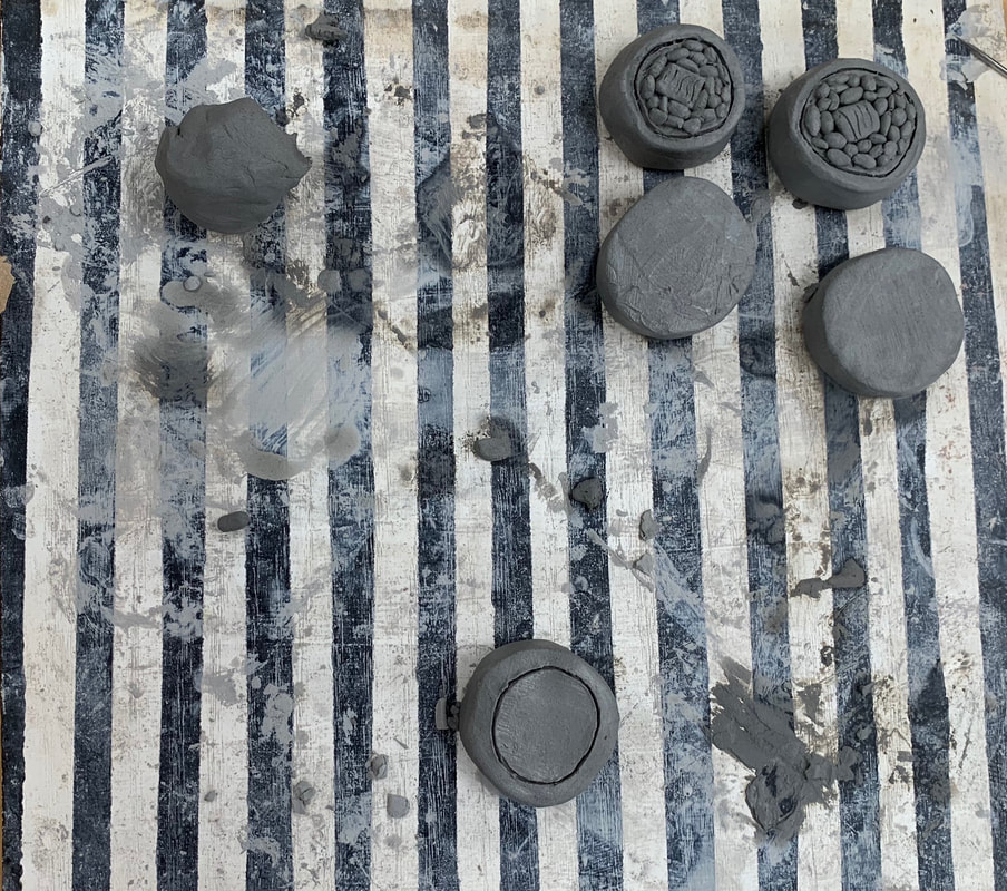
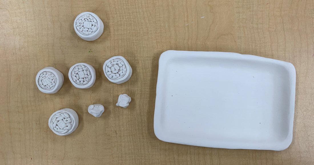
My sculpture is well executed because when I was creating it I created it the same way you would make a sushi roll. It is neat with the tray and sushi pieces but still realistic looking.
The most difficult part of this project was deciding whether I should carve the rice and filling or put it on top. I tried it carving at first and it didn’t look good so I put it on top.
When doing something 2-D you want to add value and dimension to make it look as realistic as possible. When you are constructing a sculpture it is already 3-D so you have to add texture to make it look realistic.
I created textures in the clay by using the needle tool mainly. I scratched the seaweed wrap and fillings to make them more real-life.
I think my sculpture looks mostly like sushi. I accomplished this by adding texture and making little individual rice pieces.
If I were to do this project again I would add more fillings to make it more complex and realistic. I would also probably spend more time on it.
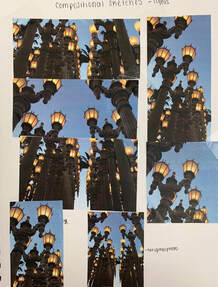
Compositional Sketches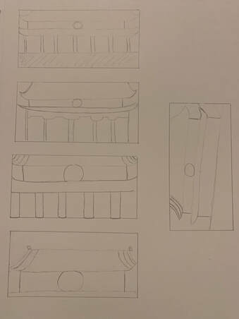 In ProgressFinal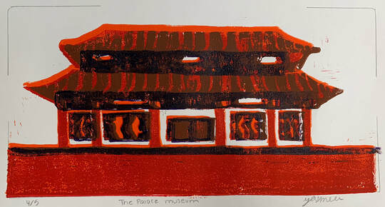 Questions
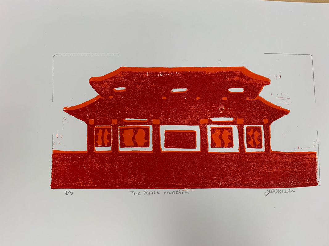
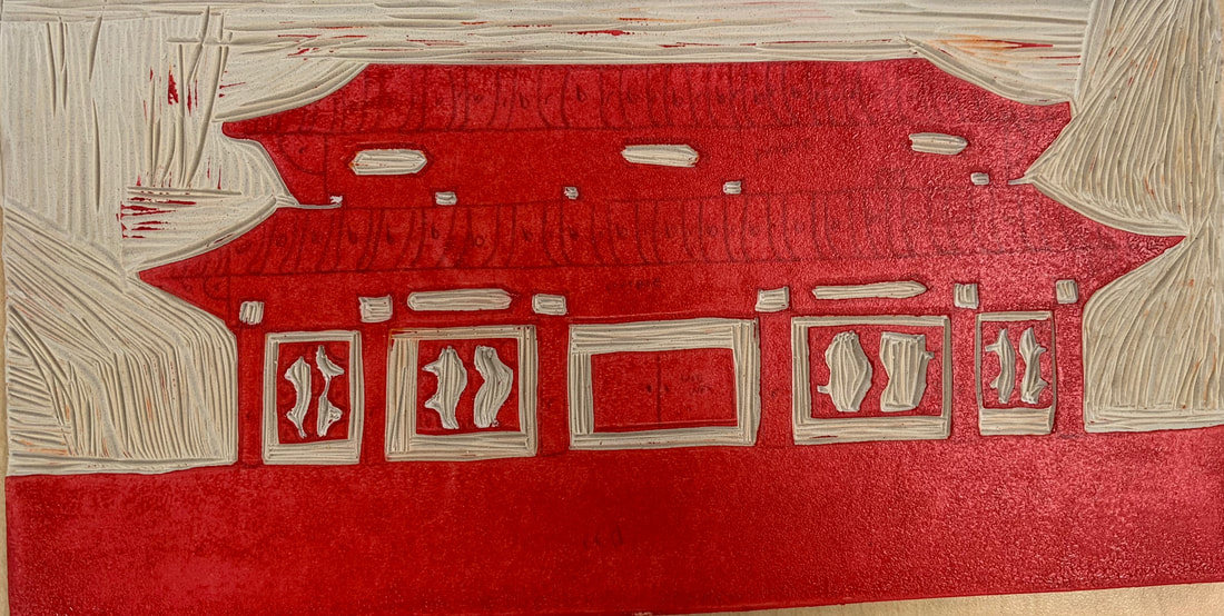
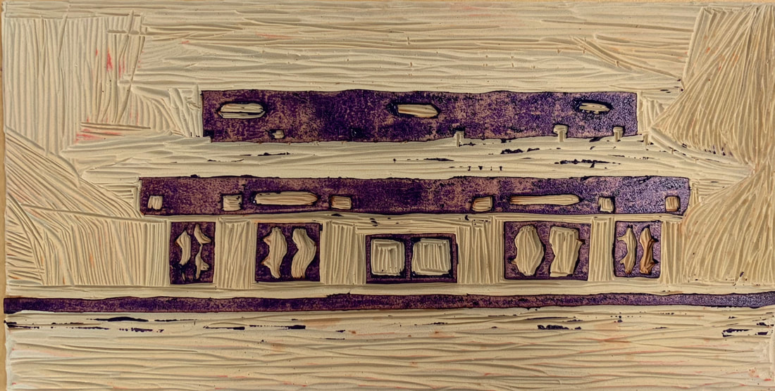
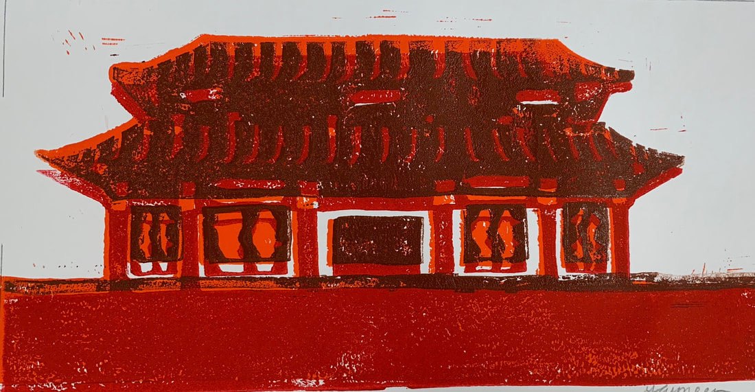
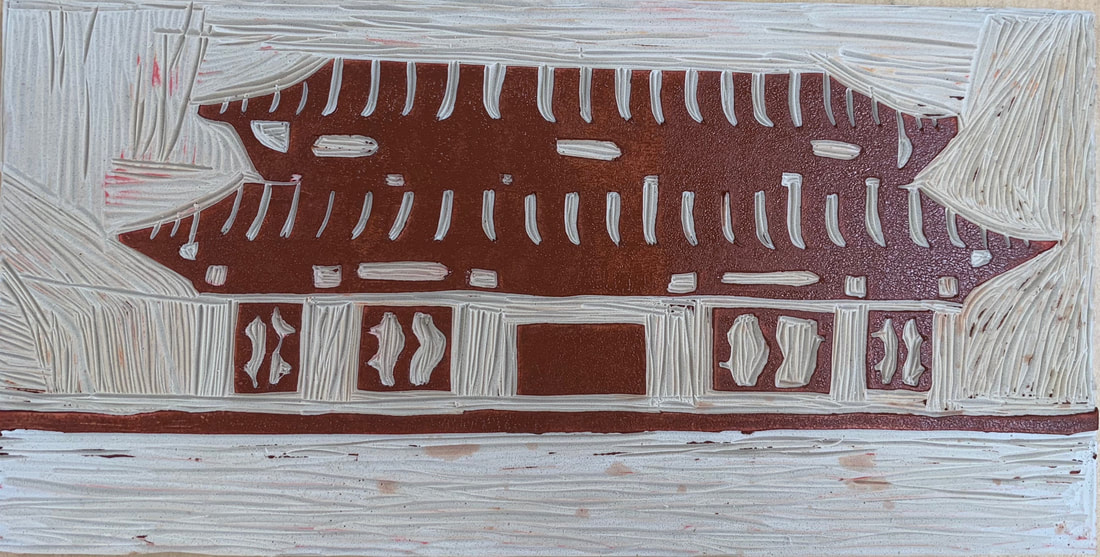
I think the craftsmanship was pretty good for the design and the transferring of the design to the linoleum. I had some small circles and squares which were a little hard to carve and keep them as small as I wanted. Overall, I think the carving and registration turned out well. -burnishing and ink coverage I think the ink coverage turned out well after the practices and figuring out how much ink I needed to use. The hardest part was lining up the prints and making sure they all looked right. It was also hard to not get the ink on the smaller pieces around the carvings. 2.How did you use texture, color harmony and balance to define your choice of subject?-texture I added texture by having the roof be two different colors to add dimension. I also added the small circles and squares to add more texture. -color harmony I tried to use colors that went well together and that were in the same color family. I also put it on white paper to make the colors stand out. --balance The design is symmetrical so both sides are pretty much the same. It was balanced because both sides are the same. 3.If you could recreate your pieces what would you do differently to enhance your final outcome?I would use different colors that went together better. I would also carve the outside of the design better so there aren’t as many lines on the outside.
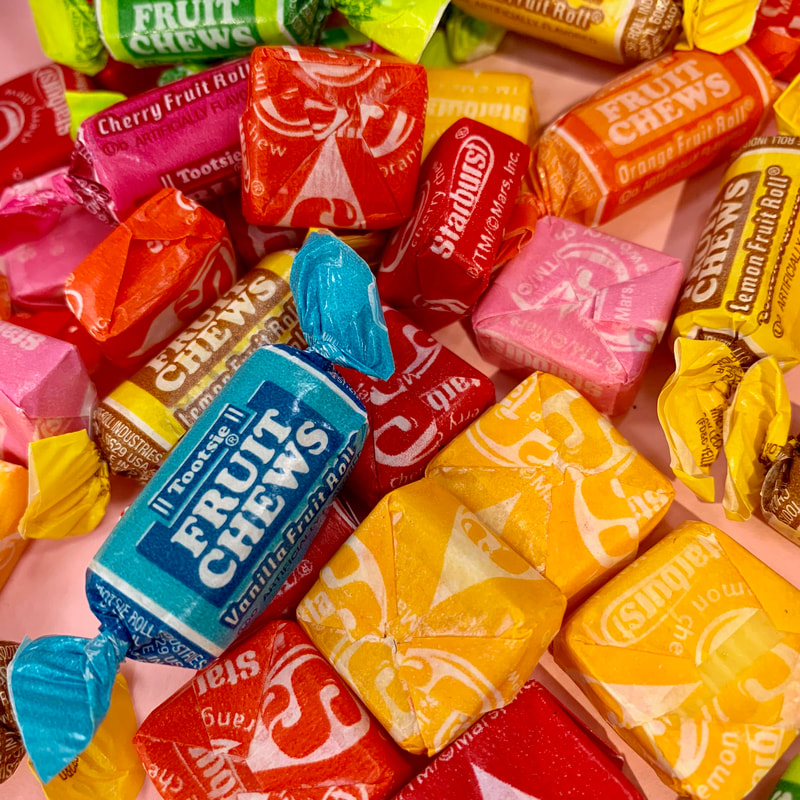
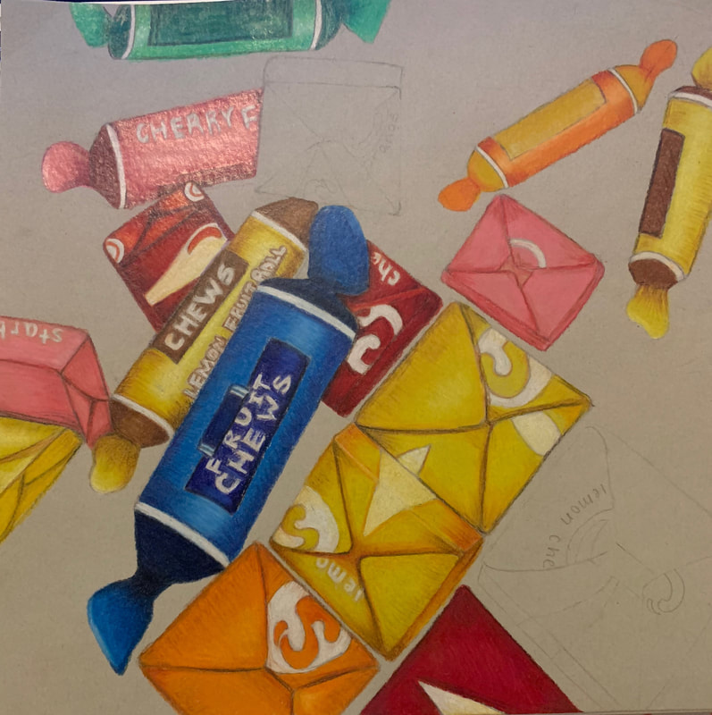
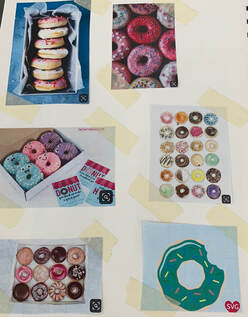
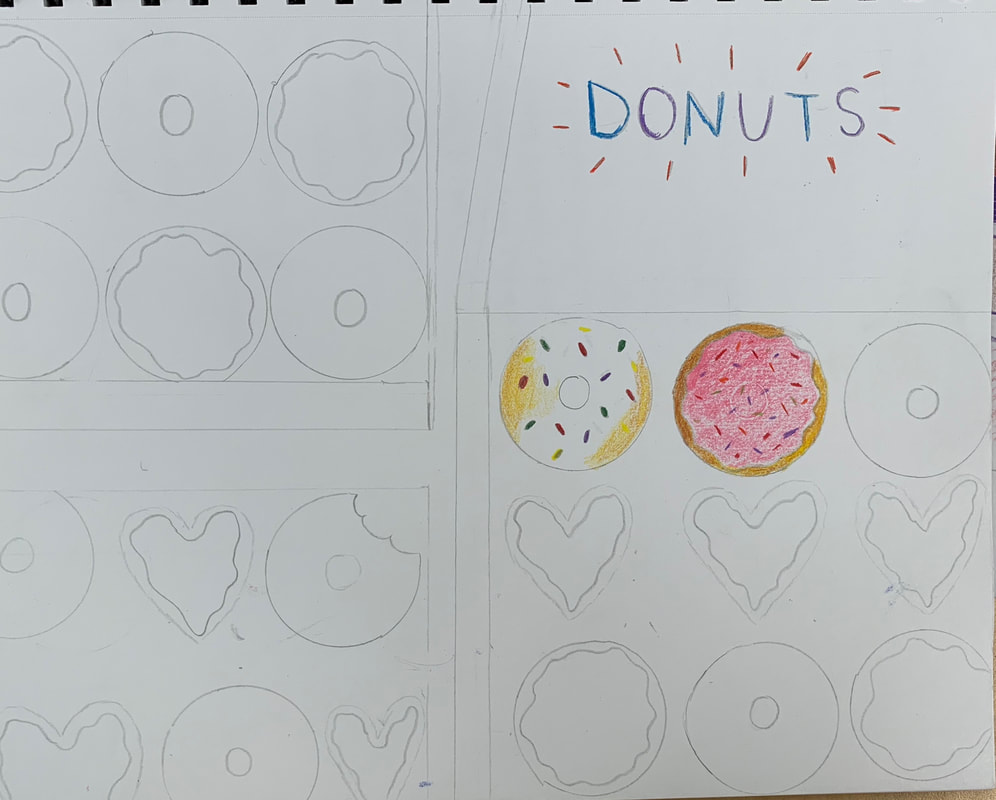
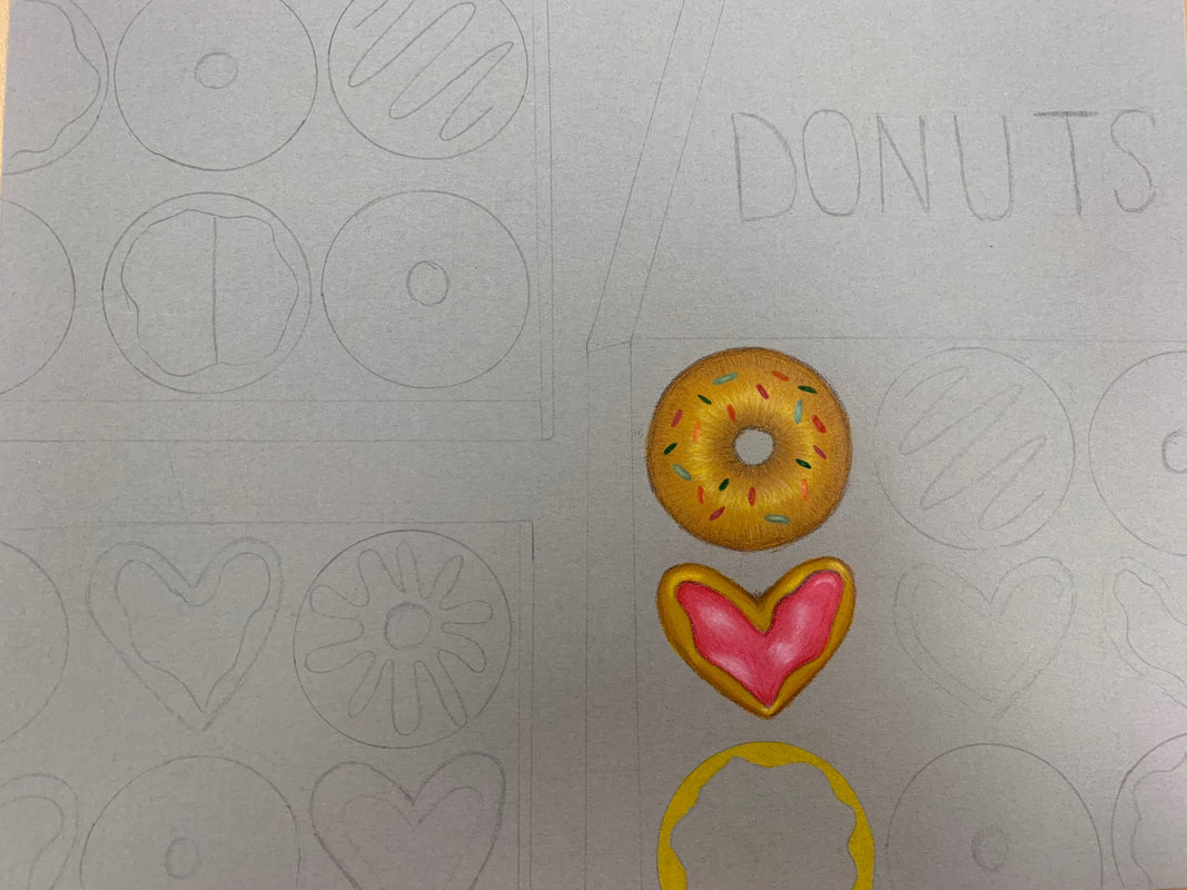
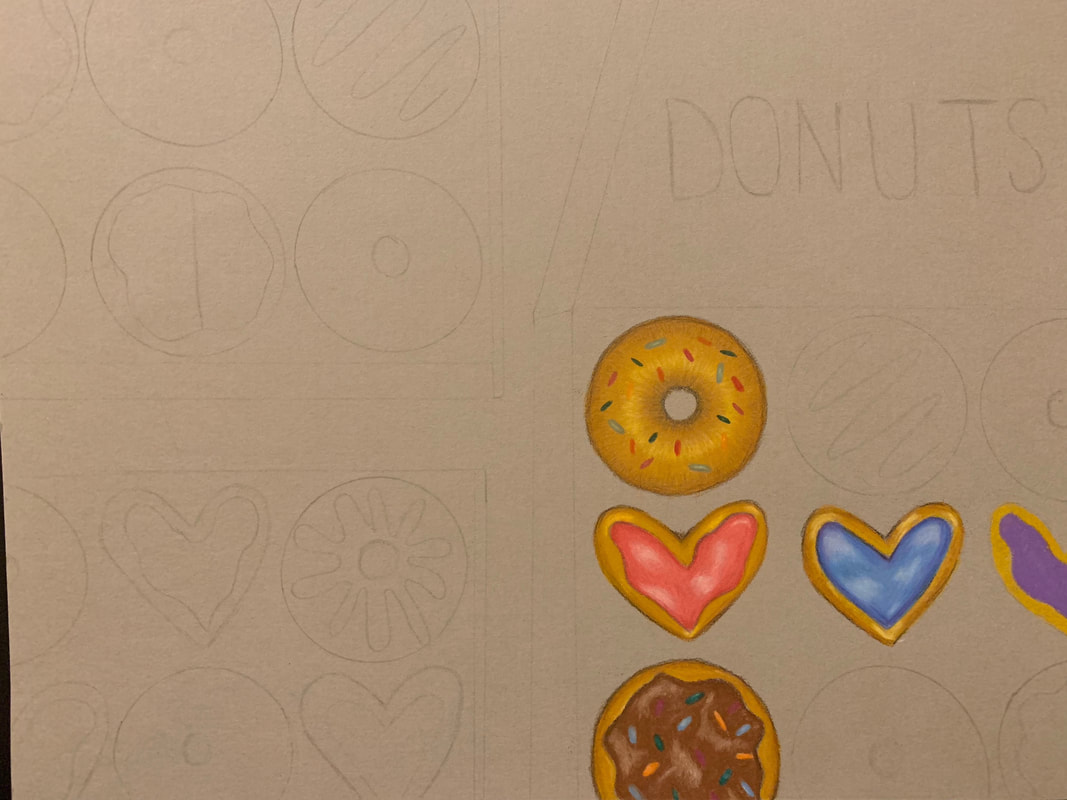
We took a picture of candy that took up the majority of the paper and then we had to draw that. I used colored pencil and added different colors to add value.
In Progress PicturesFinal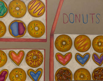 Critique Questions1.Describe the overall composition of your artwork (balance, unity, rhythm and movement).
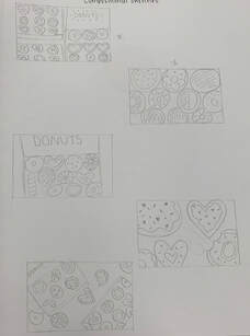
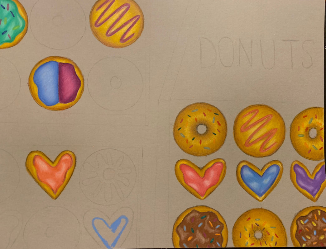
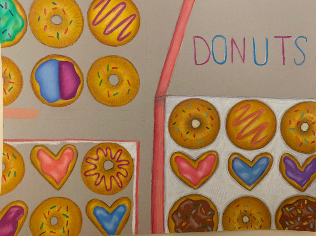
My composition of the donut boxes had a balance of negative space and areas that were filled. I feel like by having some negative space it made it more balanced and appealing to the eye. 2. How did you use value to create dimension? Is this important? Why? I added value to the donuts by making the top look brighter and the lower you got it got darker. This gave the illusion that they were round. It is important because it makes it look more realistic and not as flat. 3.What did you achieve by using exaggerated color? Using exaggerated color allowed for the donuts to look more vibrant and realistic. Also by adding different colors you wouldn’t expect in the darker areas it helped add dimension. 4.Describe the craftsmanship of your colored pencil/chalk pastel. (How good the project is technically crafted)I think the craftsmanship of my colored pencil piece was very well as it showed dimension within each donut as well as with the boxes. I used lots of colors, which made it vibrant and what I was going for. 5.Were you able to achieve depth by showing a foreground, middle ground and back- ground? Explain.I was trying to get a birds eye view of the donut boxes so they were all the same distance away from the view. If I were to do it again I might make the boxes/donuts at different distances from the viewer. 6. Explain your experience with colored pencil/chalk pastel. What were the obstacles and advantages?Colored pencil is my favorite medium so far as you can really build up the color and they blend easily. It also allows for the most realistic looking. An obstacle was that it takes time to really build up the color Practice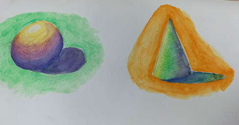 For this we practiced using watercolor pencils. I drew a sphere and a cone and added backgrounds to the shapes. Final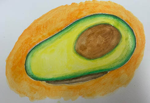 For the final piece we had to draw a fruit or vegetable. I chose an avocado and decided to add an orange background to make the green and yellow in it stand out.
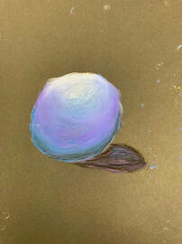
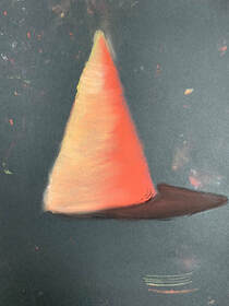
For this practice we had to use different colored chalk pastels to practice and create different shapes.I did a sphere with blues and purples and a cone with reds and oranges. 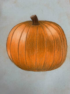 For the final piece of chalk pastels we had to do a different fruit and vegetable than the colored pencil. I chose to do a pumpkin. I think it was harder to make it look realistic with chalk pastels than with colored pencils.
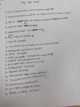
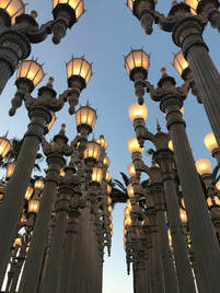
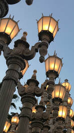
20 ideas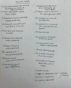 Original picture
Sketches
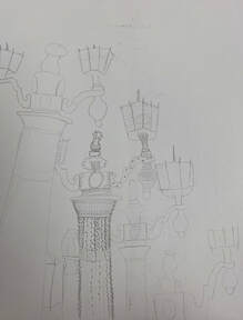
In Progress
Final Piece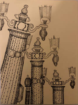 Questions
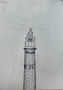
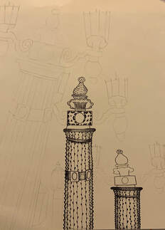
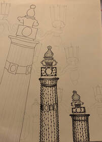
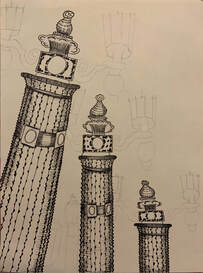
5. Explain how your knowledge and creating practice studies with value and pattern contributed to the success of your piece.My knowledge of working with pen and ink definitely grew from doing the practice assignments in class. The one that really helped was wrapping the textures around the cylinder because the lampposts in my picture were round. They helped me understand how to add value and wrap a pattern around a shape which helped the final outcome. 6.When applying the pen and ink/pattern techniques why and how is it important to make sure you understand the concepts taught in class?The concepts we learn in class allow us to practice adding value and shading with pen, such as wrapping a pattern around an object. Shading and adding value is difficult but the practices in class helped better understand the techniques before starting the final. 7.As a growing artist how do you think what you have learned will guide and better your future projects. Explain.As a growing artist I think I will spend more time from now on, on the compositional sketches because it makes a big difference. The way you look at a picture and crop/center it can make a difference. I also think I would do more sketches in the beginning and better plan my piece before starting. 8.If you could recreate your piece what would you do differently to enhance your final outcome?I would add more value to the lantern part of the post. I would try to make it look more lit up and realistic. |
AuthorWrite something about yourself. No need to be fancy, just an overview. Archives
May 2019
Categories |


 RSS Feed
